DRY – the common source of bad abstractions
The worst and hardest to maintain code that I've seen or written has been in pursuit of DRY – Don't Repeat Yourself. It's one of the first design principles engineers learn and we love to go wild with it.
Why DRY
DRY is a good muscle to develop when you're learning the basics. You should always turn code like this:
console.log(1)
console.log(2)
console.log(3)
console.log(4)
// ...
Into DRY'd up code that uses a loop:
for (let i = 1; i < 5; i++) {
  console.log(i)
}
Yes that's a silly example from beginner programming classes and you wouldn't write code like this at work. But you might write something similar when dealing with a few more layers of indirection.
Say Joe builds a navigation menu the laziest way possible:
const NavigationMenu = () => {
  return (
    <ul>
      <li>
        <a href="/about">
          <img src="question-icon.png" />
          About
        </a>
      </li>
      <li>
        <a href="/contact">
          <img src="person-icon.png" />
          Contact
        </a>
      </li>
      <li>
        <a href="/buy">
          <img src="cash-icon.png" />
          Buy
        </a>
      </li>
      // ...
    </ul>
  )
}
Every new item is a copypasta of previous items with a small change to the label, url, and icon. Super repetitive.
Jane looks at the pull request and says this code is
- tedious to maintain
- difficult to read
- easy to make mistakes when rushing through an update
We all know you're going to rush when updating this menu because it feels like a mindless task you could do in your sleep.
That's when mistakes happen 😉
How DRY goes wrong
Jane suggests DRYing up this code with a loop. An obvious choice when you have a repeating pattern with small variations.
const NavigationMenu = () => {
  const items = [
    {
      url: "/about",
      icon: "question-icon.png",
      label: "About",
    },
    {
      url: "/contact",
      icon: "person-icon.png",
      label: "Contact",
    },
    {
      url: "/buy",
      icon: "cash-icon.png",
      label: "Buy",
    },
    // ...
  ]

  return (
    <ul>
      {items.map((item) => (
        <li>
          <a href={item.url}>
            <img src={item.icon} />
            {label}
          </a>
        </li>
      ))}
    </ul>
  )
}
The team went from 10 lines of code to 28. But it's less repetitive and error prone! A single line of code defines the markup for every element, which means you only need to make changes once.
Jane isn't happy about that config object but the team can live with that. Pull request approved ✅
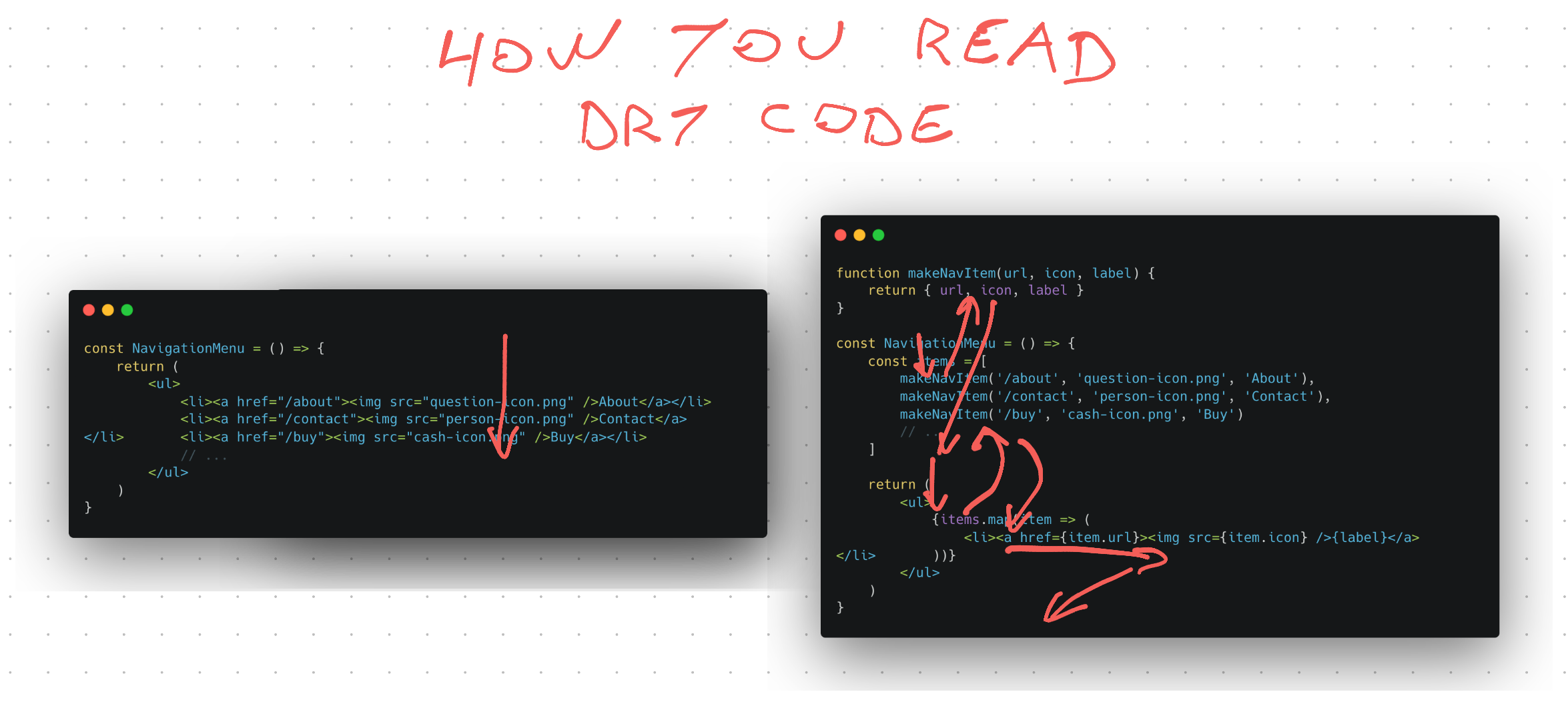
More DRY with a factory
Before hitting the merge button Alice gets an idea – that config object looks annoying as heck. Jane and Joe didn't remove the repetitiveness, they just smeared it around.
Next person to add a link will copypasta an object then change string values. That's not great.
She decides to pull out ye olde hammer factory factory and write a function that spits out each config element. Later this could be expanded into a smarter factory with more logic.
function makeNavItem(url, icon, label) {
  return { url, icon, label }
}

const NavigationMenu = () => {
  const items = [
    makeNavItem("/about", "question-icon.png", "About"),
    makeNavItem("/contact", "person-icon.png", "Contact"),
    makeNavItem("/buy", "cash-icon.png", "Buy"),
    // ...
  ]

  return (
    <ul>
      {items.map((item) => (
        <li>
          <a href={item.url}>
            <img src={item.icon} />
            {label}
          </a>
        </li>
      ))}
    </ul>
  )
}
The team is back to 20 lines of code thanks to JavaScript's convenient object creation syntax. That's double the original 10 lines, but very DRY.
- a factory returns each config object
- you collect those in a list
- loop through data to render items
Adding and removing items is now easy. You could even make it dynamic and pull the list from a content management system.
But unless Jane, Joe, and Alice use this pattern everywhere, reading the code got harder. You have to jump around and maintain mental state to understand how it works. As opposed to linearly reading top-to-bottom.
Confusing code paths aren't even the worst part. This is the wrong abstraction.
Why this is a bad abstraction – separation of concerns
A few months pass and the marketing team wants to run an experiment: Will the buy button get more clicks with a red border?
Joe looks at the code and his heart sinks. The abstraction is optimized for keeping all buttons the same. They're all coupled together and there are no affordances for buttons to evolve in diverging directions.
Now Joe has a choice to make:
- throw out the DRY and rewrite back to simple code
- add more parameters to configure buttons
- rewrite the abstraction
Notice two of those follow the "You can't fix the wrong abstraction" idea. One makes it worse and goes down the path of factories with a bunch of boolean arguments to carefully tune behavior with each use.
That's a common thing that happens with factories. They become so complex you might as well write the underlying code directly.
The team's mistake was that they didn't wait long enough to observe how this code evolves. At the time it looked like all navigation buttons need to look the same. But one button was not like the others, it had different semantics.
About and Contact are navigation items. Buy is an action that starts a user flow. This is a subtle but important difference because it indicates that the Buy button is likely to diverge in behavior.
These subtle distinctions are almost impossible to notice ahead of time. But they're always obvious in retrospect.
Creating a better abstraction
Joe takes this opportunity to do some codebase gardening. The previous abstraction was premature, but the styling change that marketing asked for gives him insights into how to separate concerns.
You have 2 concerns:
- The menu
- The button
Those can become React components.
const MenuItem = ({ href, style, icon, children }) => (
	<li style={style}><a href={href}><img src={icon} />{children}</a>
)

const NavigationMenu = () => {
	return (
		<ul>
			<MenuItem href="/about" icon="question-icon.png">About</MenuItem>
			<MenuItem href="/contact" icon="person-icon.png">Contact</MenuItem>
			<MenuItem href="/buy" icon="cash-icon.png" style={{ border: '1px solid red' }}>Buy</MenuItem>
		</ul>
	)
}
This abstraction makes it easy to make exceptions. You don't need to fiddle with a loop that behaves differently in one of the iterations.
And the composition pattern (using children) makes it easy to render rich labels. You can add any additional markup to the Buy button, if you want.
Popular design libraries lean into this further by taking React components for the icon prop. That way you have more control over rendering the icons.
The separation of concerns becomes:
- NavigationMenu for the structure of the menu
- MenuItem for the structure of each item
- each rendered entry for the values of an item
That's the pattern design libraries landed on after observing how thousands of codebases evolved over years of development. Observing desire paths works :)
Cheers,
~Swizec